Welcome
Welcome to Inspired Website! I’m so glad you’re here.
Watch this video orientation to get a sense of what to expect from the process.

The entire process is laid out below. If you’d prefer to do the exercises on paper, download and print this workbook:
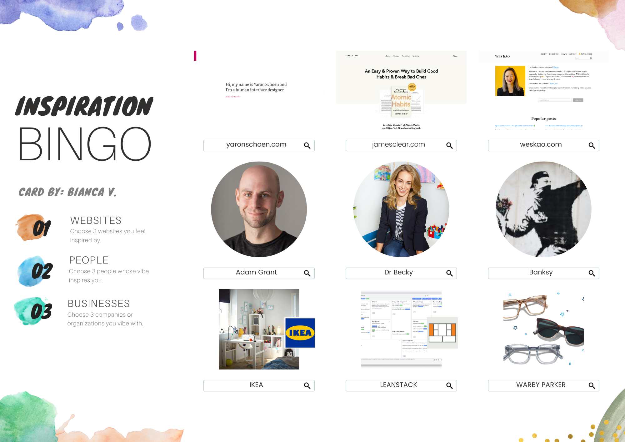
Play Inspiration Bingo
As solopreneurs, it's extremely helpful to be able to communicate the essence of what we're about—our values and our style—in as few words as possible.
Unfortunately, the process of figuring out the right words to use can get heavy and confusing quickly. Especially when we're doing it alone.
Inspiration Bingo is a playful way put language to your vibe by exploring people and things that draw you in and inspire you.
Click this link to open the Canva template. (If you haven't uploaded photos in Canva before, check out this 1-min video.)
Capture Your Inspiration Bingo Card
Tip: You can use siteinspire.com and onepagelove.com to find cool website designs.
Websites | |||
People | |||
Businesses |
Here’s what your finished card will look like:

Analyze Your Bingo Card
What’s one pattern you notice among the websites that inspire you?
What’s one pattern you notice among the people who inspire you?
What’s one pattern you notice among the businesses that inspire you?
What’s one pattern you notice across categories?

Own Your Vibe
Trust Your Gut
This lesson will provide you the baseline mindset to trust your intuition and accept the creative challenge of building a website in 5 days.

You have to leave the city of your comfort and go into the wilderness of your intuition. What you’ll discover will be wonderful. What you’ll discover is yourself. - Alan Alda
What makes it hard to trust your intuition?
Do you accept the creative and self-discovery challenge of creating a website that feels like you in 5 days without overthinking?
What do you need to make this challenge fun?

Name Your Vibe
This lesson will take you from identifying and analyzing your inspiration, through to choosing a template for your website.
1. Practice Identifying Vibes
Let’s practice identifying vibraphones vibes by naming the PRIMARY and SECONDARY vibes of the websites and people who inspired you.
Here’s a list of words you can play with. (Feel free to come up with your own!)
Sincere | Exciting | Competent | Sophisticated | Rugged | Playful |
Accessible | Bold | Organized | Classic | Powerful | Quirky |
Down-to-Earth | Daring | Functional | Formal | Tough | Fun |
Inviting | Innovative | Trustworthy | Exclusive | Ambitious | Imaginative |
Honest | Spirited | Reliable | Polished | Strong | Creative |
Tip: If you’re struggling to identify a specific vibe, start with describing its temperature. Is it hot, warm, cool, or cold?
Thinking about what kind of energy a vibe has can be clarifying. Traits like passion feel hot; sensitivity feels warm; sophistication feels cool; functionality feels cold.

Look at your three inspiration websites. How would you describe their vibes?
Site 1: | Site 2: | Site 3: | |
Primary Vibe | |||
Secondary Vibe |
Look at your three inspiring people. How would you describe their vibes?
Person 1: | Person 2: | Person 3: | |
Primary Vibe | |||
Secondary Vibe |
Trusting that you’re inspired by things that resonate (trust your intuition), come up with three ways to describe your own vibe.
Option 1 | Option 2 | Option 3 | |
Primary Vibe | |||
Secondary Vibe |
Which of these feels the best for you right now? (Remember that this is a discovery process; you can always play and iterate later.)

2. Break Vibes Down
The whole is more than a sum of its parts.
How do you create a vibe? In real life… it’s complicated. In websites, a vibe is created largely by the combination of UI (User Interface) elements. UI elements form the “skin” or “texture” of a website.
You don’t need to become a UI designer to start seeing how these elements work together. A little vocabulary and observation will take you far.
Let’s break down what you first see when you open a site—the “hero section.” Practice naming the basic elements that contribute to a vibe so you can think and talk about what you like (and don’t like) with more clarity.
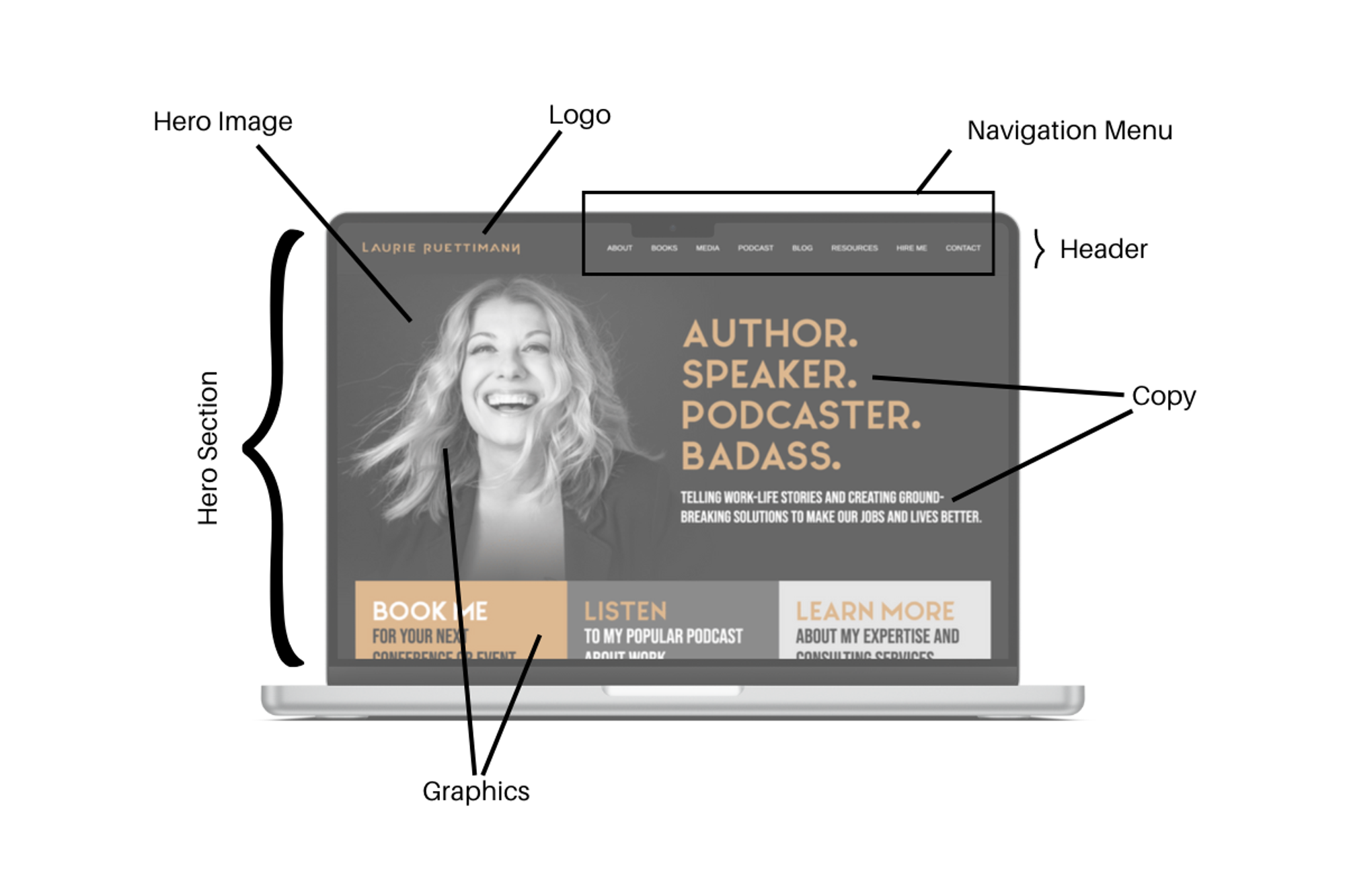
Hero Section | What you see on the screen when you first land on a site |
Hero Image | A graphic used in the hero section, usually spanning the whole view |
Header | The top part of the site that you see on every page (usually includes a navigation menu and logo) |
Navigation Menu | Featured links to internal pages |
Copy | The language AKA text of the site. Copy appears in different font styles, including at least one header font (for titles) and one body font (for paragraphs) |
Graphics | All visual elements, including illustrations, photographs, icons, patterns. Graphics comes in different colors, sizes, and styles |
Layout | ow the elements (graphics and copy) are laid out across the space of the screen |
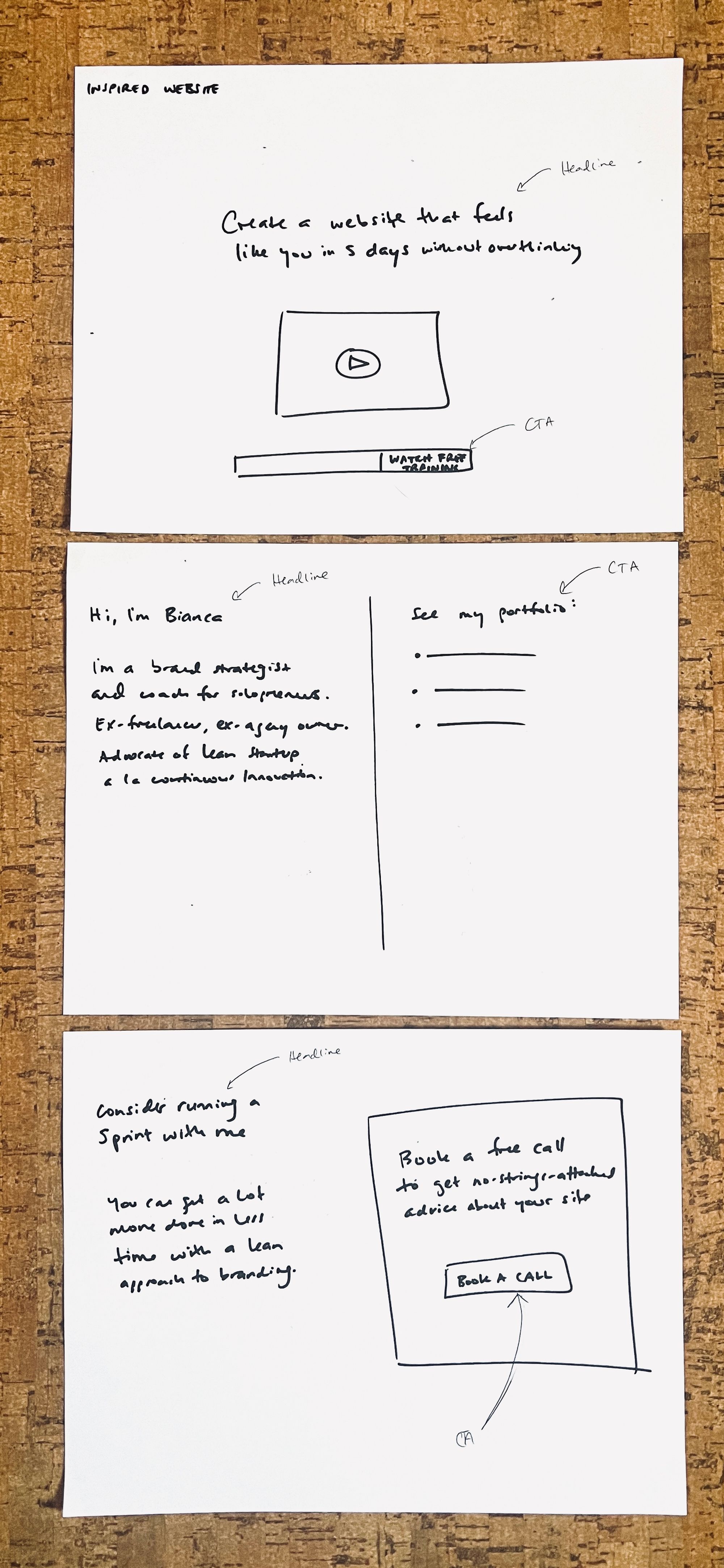
Let’s analyze this website’s vibe by breaking down the elements. Here’s one way to describe them for this example website, https://laurieruettimann.com.
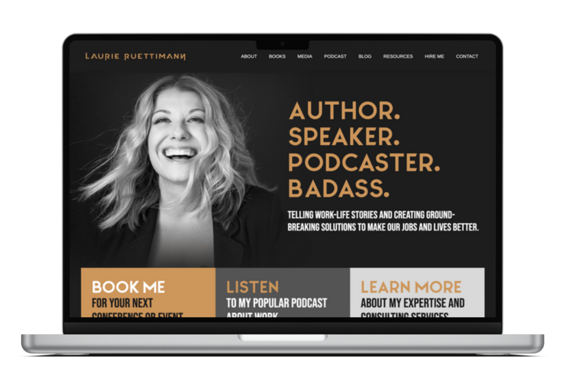
Hero Section | Black background with large copy and graphics |
Hero Image | Black and white headshot |
Header | Logo left, menu right |
Navigation Menu | 8 links, all caps |
Copy | All caps, modern font with slightly rounded edges |
Graphics | Simple, large, monochrome (grayscale or muted orange) |
Layout | Very symmetrical and organized, rectangular sections |
How would you describe the vibe that this combination of elements creates?

Now open up one of your inspiration websites.
How did you describe the vibe of this site?
How do the UI elements contribute to the vibe?
Hero Section | |
Hero Image | |
Header | |
Navigation Menu | |
Copy | |
Graphics | |
Layout |
3. Vibe With a Template
If you’re new to web design, templates are an incredible way to build a beautifully designed site without learning a ton of new skills from scratch.
If you are a designer or developer, templates can help smash through creative blocks by giving your brain a starting point.
Creativity loves constraints.

Choose Your Website Builder
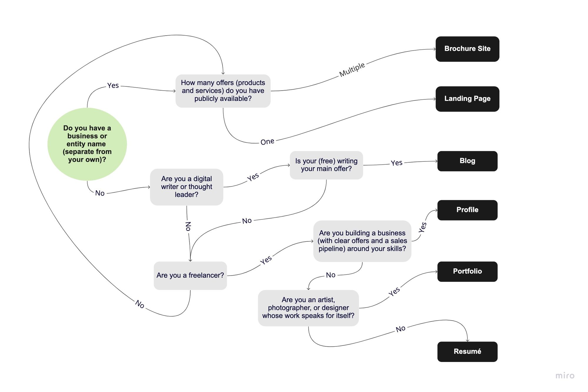
Of course, to find a template, you’ll need to start with a website builder. Here’s a decision tree to help you find the right one for your situation.
.jpg?id=ca7ec20e-3b80-41ae-a90a-694dad44cb0f&table=block)
Which website builder will you use?
If you haven’t yet, create an account on your website builder site.
Once you enter the website builder, your mission is to find a template that matches your vibe and site type.
Specific colors, fonts, and graphics (like photos and illustrations) are easy to swap out. The layout is slightly harder to change, so if you’re not confident about your design skills, focus on finding a template that’s laid out the way you like.
Optional: Choose Your Site Type
When you open your website builder, you might be prompted to choose what type of site you want.
If you’re not sure how to navigate the different templates, here’s a quick rundown of common site types that might work for you.
Note: Not all sites fit cleanly into one category. We’ll talk more about the purpose and structure of your site in Craft Your Story. What matters most right now is that you pick a template that sets the tone you want to set.
Profile
(Personal) | Brochure (Business or Services) | Landing Page (Sales Page) | Resume (CV) | Portfolio | Blog |
Used by personal brands and thought leaders | Used by companies with multiple offers and a brand name | Effectively used to feature and sell a single offer | Used by employees & freelancers to feature skills | Used by designers and artists with a visual portfolio | Used by digital writers to feature content |
Tend toward personable vibe | Tend toward professional vibe | Requires lots of clarity about offer | Tend to be simple with a personal touch | Requires high quality photo or video assets | Requires lots of written content |
Practice identifying site types by looking back at your inspiration sites.
Site 1: | Site 2: | Site 3: | |
Site Type |
Still not sure what kind of site you’d like to have? Here’s another decision tree to make things easier.
Your site type is:
Choose Your Template
Now that you know what you’re looking for (a template that matches your vibe and has the layout you want according to your site type), pick a template in your website builder. You’ve processed lot of information today; trust that your body can make a good decision and let your gut choose for you.
Still not sure which template feels right? Play with a few, make a note of three promising options, and come back later with fresh eyes.
Build Your Style
This lesson is a step by step guide through the different graphic elements that will contribute to the vibe of your website.

1. Reflect
Today’s mission is to recreate your vibe through design.
Your style matters. Not because you need to seem cool or smart to succeed or win a popularity contest. But because when you look and sound like yourself, you gain confidence and trust.
When it comes to building out a style through design, your vibe is your north star.
Your vibe (primary + secondary term) is:
What’s one thing you took away from the process of naming your vibe?
Today’s work involves many steps, but it’s super fun stuff. You might find yourself playing with a dozen alternatives at every step—I don’t blame you! Just be mindful of how long you have allocated for website today and pace yourself.
I trust you’ll find a good rhythm of experimenting (divergent thinking) and deciding (convergent thinking).
By the end of today, you’ll have styled your website in a way that looks and feels like you. Plus a Style Guide to codify these choices, if your left brain likes that kind of thing.

2. Analyze Inspiration Site Styles
Quick Guide
How do your inspiration website styles achieve their vibe? Let’s break down the elements we’ll be looking at in this session:
- Graphics: Identify how many and what kind of graphics the site contains.
- Colors: Identify the site’s colors using a standard 5-color palette commonly used by website builders.
- Fonts: Identify the size, style, weight, and capitalization of the font.
Website 1
Domain
Colors
Lightest | Light | Main | Accent | Darkest |
Graphics
Header Font
Subheader Font
Body Font

Website 2
Domain
Colors
Lightest | Light | Main | Accent | Darkest |
Graphics
Header Font
Subheader Font
Body Font

Website 3
Domain
Colors
Lightest | Light | Main | Accent | Darkest |
Graphics
Header Font
Subheader Font
Body Font

3. Find Your Headshot
Getting a good headshot can be a can of worms. It can also be a great starting point for building your style.
If you already have a headshot you love, use it! Consider what you like about it (is it your expression? the colors? the setting?). Leverage what’s already working for you. We tend to spend a lot more time thinking about how to present ourselves in photos than about how to present ourselves in websites.
If you don’t have a headshot you like, watch this short video to see a photographer break down how to DIY your headshot with a smartphone: https://www.youtube.com/watch?v=rgj-w_iyTGM
Good Headshot Checklist

*Tip: If you have a good photo with a distracting background, use “Background Remover” in Canva to get rid of it.


4. Find Your Graphics Collection
A pre-designed graphics collection is the easiest way to create visual consistency and personality on your site. It’s my #1 tip for elevating sites from plain to stunning.
Let’s figure out what kind of graphics you need.
How many graphics did your inspiration websites tend to have?
What kind of graphics did your inspiration websites have?
What kind of graphic collection would you like to use for your site?
We recommend you pick one for this iteration.
Photos | |
Hand-drawn Illustrations | |
Computer Illustrations | |
Lettering | |
Icons | |
Geometric Shapes | |
Patterns |
Tip: Canva contains 40+ collections of 20-60 graphics. You can also use “Magic Recommendations” when searching for graphics to see graphics in the same style of any single graphic you like.
5. Find Your Color Palette
We’re going to create a 5-color palette for your site.
Tip: If your graphics collection came with a set of colors, draw from those to build out your palette.
First, pick a main brand color.
Color is highly individual and personal. But it’s useful to consider color psychology, cultural context, and industry standards when selecting your main color.
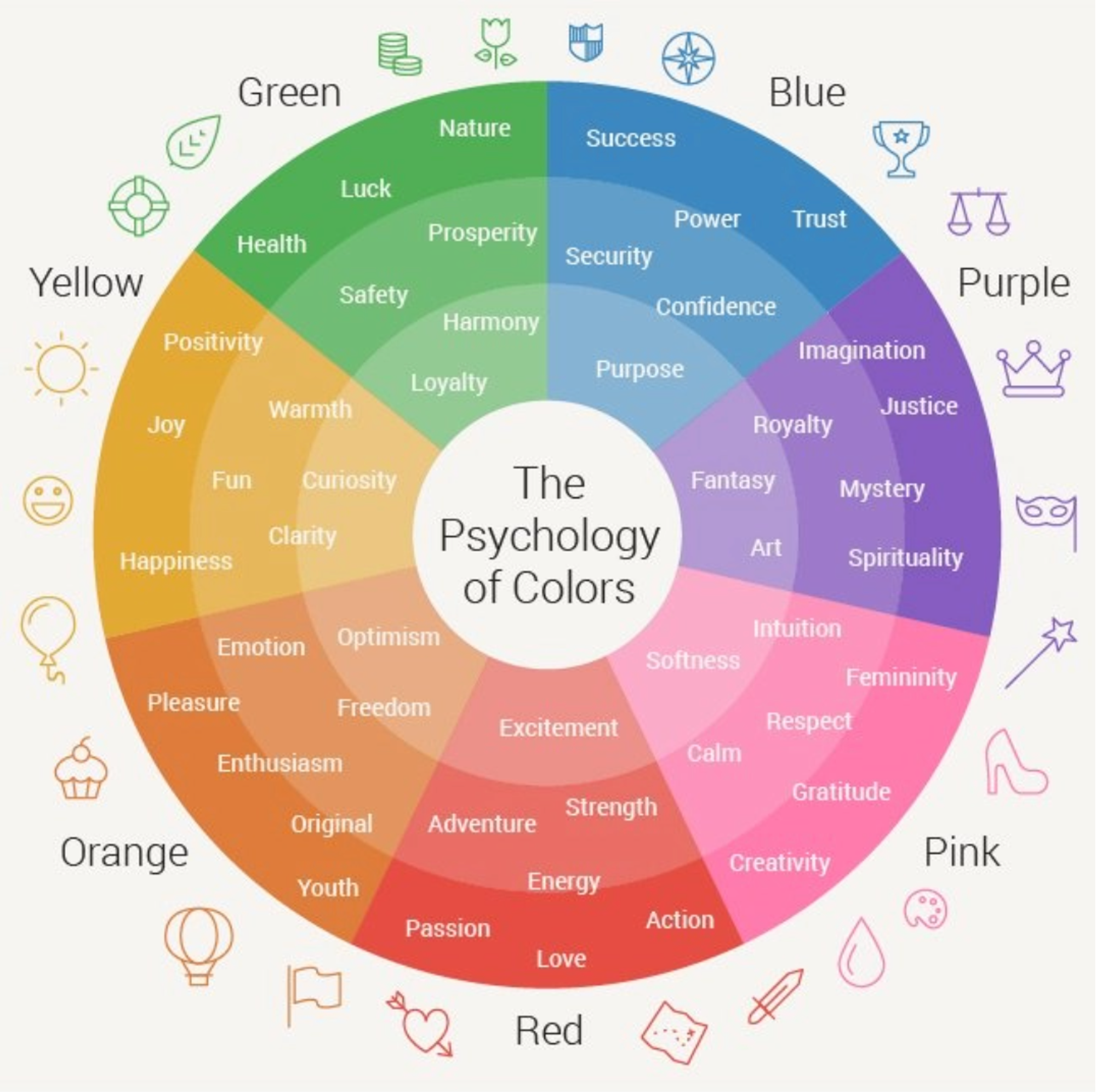
What’s your main color?
Do you want a soft, medium, or intense shade of that color?
Once you’ve chosen a color, it’s time to make a color palette! Remember, color palettes and fonts are really easy to change on your website. We’re looking for a starting point, a v1.0.
Tip: If you’re using your graphics collection or a photo as a reference, click on “Image Upload” inside colormind.io to automatically pull colors.
Make your palette:
- Open colormind.io
- Click on “Website Colors” in the navigation
- Select your main color by clicking the middle block
- Click the lock icon to lock that color in place
- Next, choose your lightest color. This will likely be the background of much of your site. You can refer to your inspiration sites for ideas. Most sites will choose between one of the following:
- Put your lightest color in the leftmost block and lock it.
- Next, choose your darkest color. This will be used for text and dark backgrounds. Here are common options (the differences are subtle but real!):
- Put your darkest color in the rightmost box and lock it.
- If you have another color in mind, add it now. Otherwise, click “Generate” to see possible color palettes.
- Scroll down to see a mockup of how the palette could look on a site.
- Once you’ve found a palette you like, take a screenshot for future reference.
- Write down the HEX code of each color below. (These are very important. You’ll need these for your site and everything else you design online!)
# | # | # | # | |
Lightest | Light | Main | Accent | Darkest |
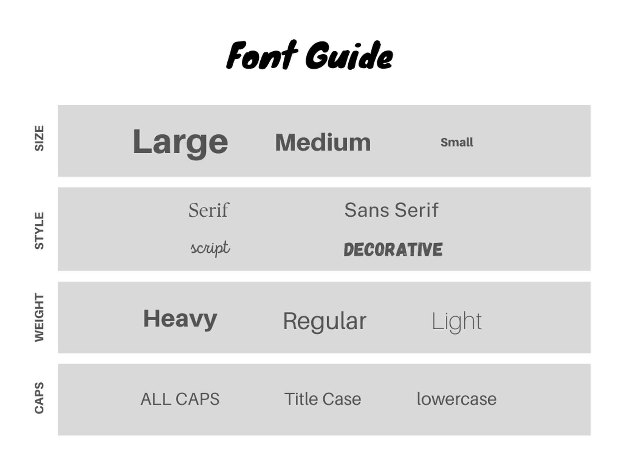
6. Find Your Font Pairing
Review your inspiration website style analysis.
What trends did you see in the header fonts?
What trends did you see in the body fonts?
When it comes to fonts, you need to know two main principles:
- Contrast. Higher contrast between headers and body fonts is generally considered good design, because it’s easier to read. Look for fonts that feel aligned but look very distinct.
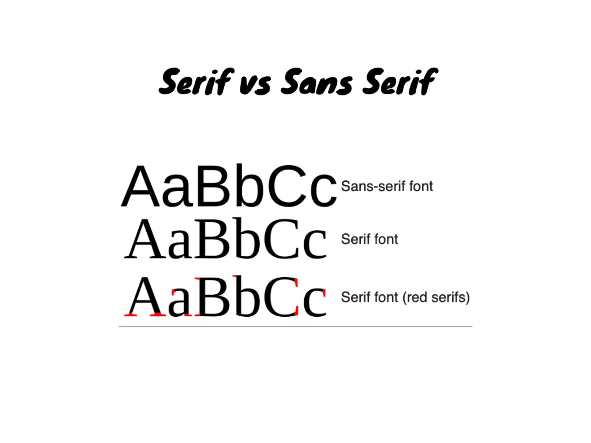
- Legibility. Fonts exist to be READ. Always make sure your fonts are large enough, heavy enough, and stand out enough against the background to be scanned in a hurry. Sans serif are a favorite in digital design because they’re easier on the eye. Website fonts should generally be at least 16 px large for legibility (larger for headers, and at least 18px for text-heavy sites).
Let’s find your pairing!
- Visit fontpair.co
- Click on “Pairings” in the menu
- Choose a pairing that fits your vibe
- To keep things simple, create a subheading style that’s in the same style as your body font (just bigger, heavier, and/or ALL CAPS)
- Write your choices down below
Tip: Keep in mind that not all platforms have the same fonts available. Google Fonts are free, so you can download them from fonts.google.com and upload them to any platform that allows you to upload new fonts (like Canva). If you can’t upload a font you like, choose the most similar available type.
Your Header Font
Your Subheader Font (H2, H3)
Your Body Font
7. Create a Logo
If you don’t have one already, create a simple logo in Canva: https://www.canva.com/search/templates?q=logo
I highly recommend a name logo (just text) in black font on a white background. (See some options here.)
Tip: For the most simplicity and ease, you can even just create a logo using a version of your header font! Save it as a png file and you’re good to go.
You’ll also need a small square version of your logo called a favicon. Favicons are 16x16 or 32x32 pixel icons that show up in your browser window. You can make one on https://favicon.io/
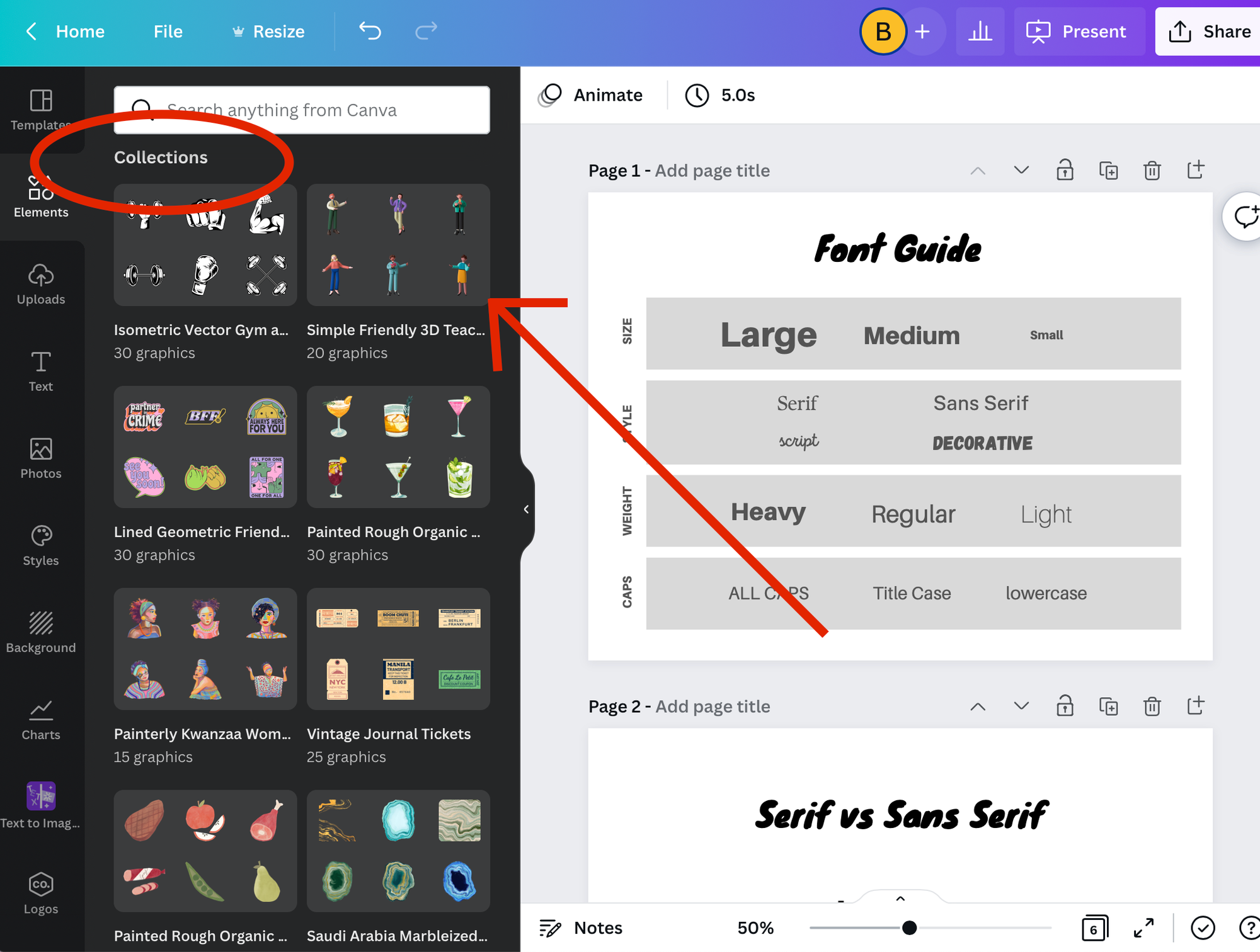
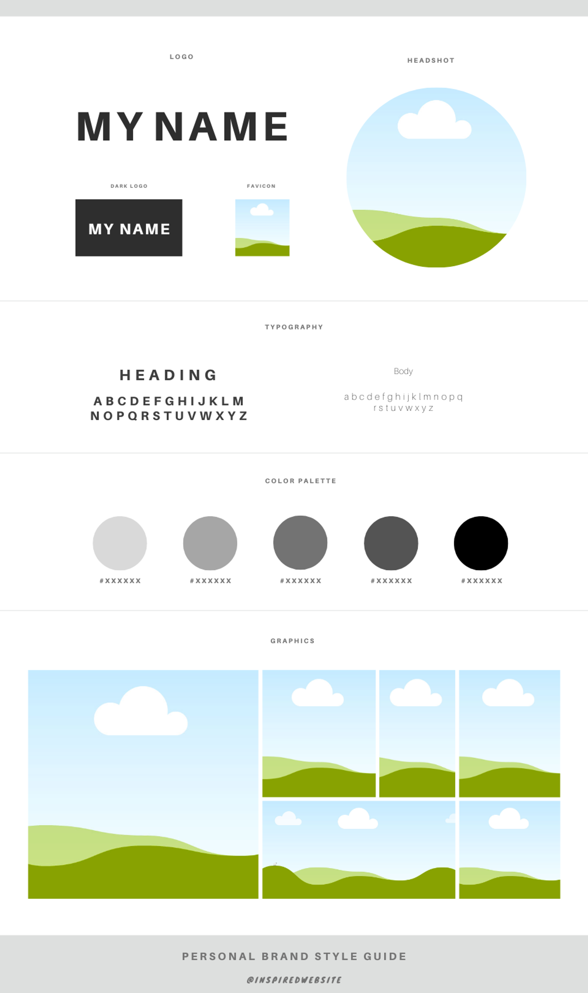
8. Create Your Style Guide
Put everything together for future reference by creating a personal brand-focused Style Guide template on Canva. Click here to create your version.
Here’s a preview of the template:
9. Style Your Site
Time to put it all together!
- In your website builder, find the universal style settings. It should be under a label like “Site Styles” or “Design.” As soon as you change these settings, the style of your whole site will change.
- Add your color palette (using your HEX codes).
- Add your fonts.
- Play with adding graphics to the hero section of your page. We’ll get into creating the rest of your site next time! (Which will be so much easier now that you have a collection of graphics to work with.)
Craft Your Story
Free Your Mind
How to work with the chaos inherent in the creative process.

Invention, it must be humbly admitted, does not consist in creating out of void but out of chaos. - Mary Shelley
How has the combination of freedom + constraints in this process felt so far?
What’s something you’ve learned about yourself?
Create a Paper Experience
We walk through:
- Why story is the essence of good copy and good UX (user experience)
- How to get to the core of your message
- How to frame and plan the pages of your site

Up to now, we’ve been focused on owning your vibe. Now it’s time to own your story. Stories are more concrete and sequential than vibes.
- Vibes (expressed through design) give you a feeling
- Stories (expressed through copy) give you an experience
In order to create an experience with your website, you’ll need to know:
- What you want to say
- The order you want to say it in
Everything else is details.
But it’s no easy task figuring out the essence of your message. For website purposes, your core message will include:
- Your bio: who you are and where you’re coming from
- Your unique value proposition: what problem you solve for people
- Your offers: how exactly people can engage with you to solve that problem
Clarity about your core message translates to a delightful experience for your user (and more room for you to play!). A complicated or unclear core message translates to a confusing experience (and unnecessary headache for you).
Analyze Your Inspiration
Before diving in, we’re going to practice mining core messages. Let’s start with your inspiration companies from Inspiration Bingo.
Reflecting on your current understanding of each company (no need to research), summarize their unique value propositions using this template:
Example 1 | Nike helps non-professional athletes get cool workout gear so that they can move and exercise without feeling like an imposter. |
Example 2 | Oprah helps women hear inspiring content so that they can change their lives without losing touch with their identity. |
Example 3 | James Clear helps thinkers change their habits so that they can move toward any goal without overwhelming themselves. |
Company 1 | |
Company 2 | |
Company 3 |
Next, we’re going to find a new kind of website to be inspired by: a Mirror Website. Instead of learning the nitty gritty of UX design and copywriting, we’re going to use your mirror website as a template for your copy + user experience.
First, identify a site that does what you want your site to do. An inspiration site or template may be perfect for your mirror site.
If you want to find a new one, below are some examples in each category.
Site Type | Multi-Page Examples | One-Page Examples |
Profile | ||
Brochure | ||
Landing Page | - | |
Resume | - | |
Portfolio | ||
Blog | - |
Your mirror website:

Now we’re going to analyze how your mirror site works. How does it tell a story and create an experience?
We’re going to draw the site out on paper, breaking down the following:
- Pages: Distinct sections
- Headers: Featured copy at the top of each page or section
- Offers/Calls to Action (CTAs): Ways to engage
- Content: Graphics or copy, usually supporting a call to action

Paper, pen, and marker ready? Go ahead and draw out your mirror site.
Tip: You can take a full-page screen capture to get a better sense of what the full site looks like. (If you’re using Chrome, I recommend using the extension Go Full Page.)
Here’s an example from jamesclear.com:
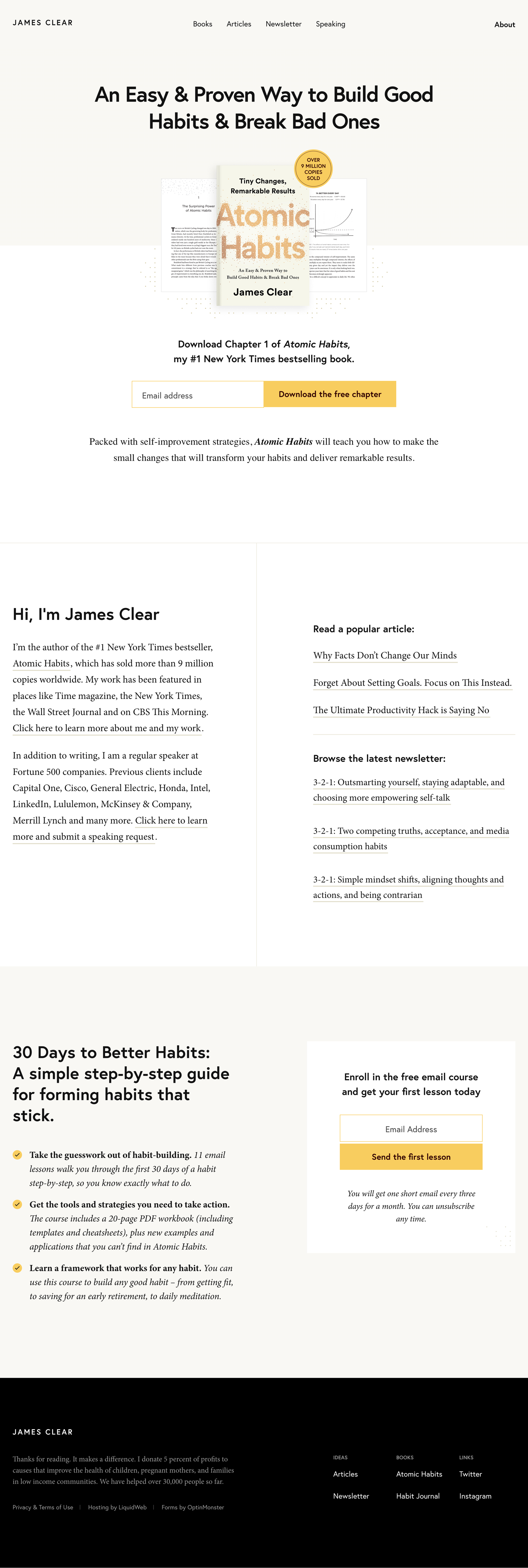
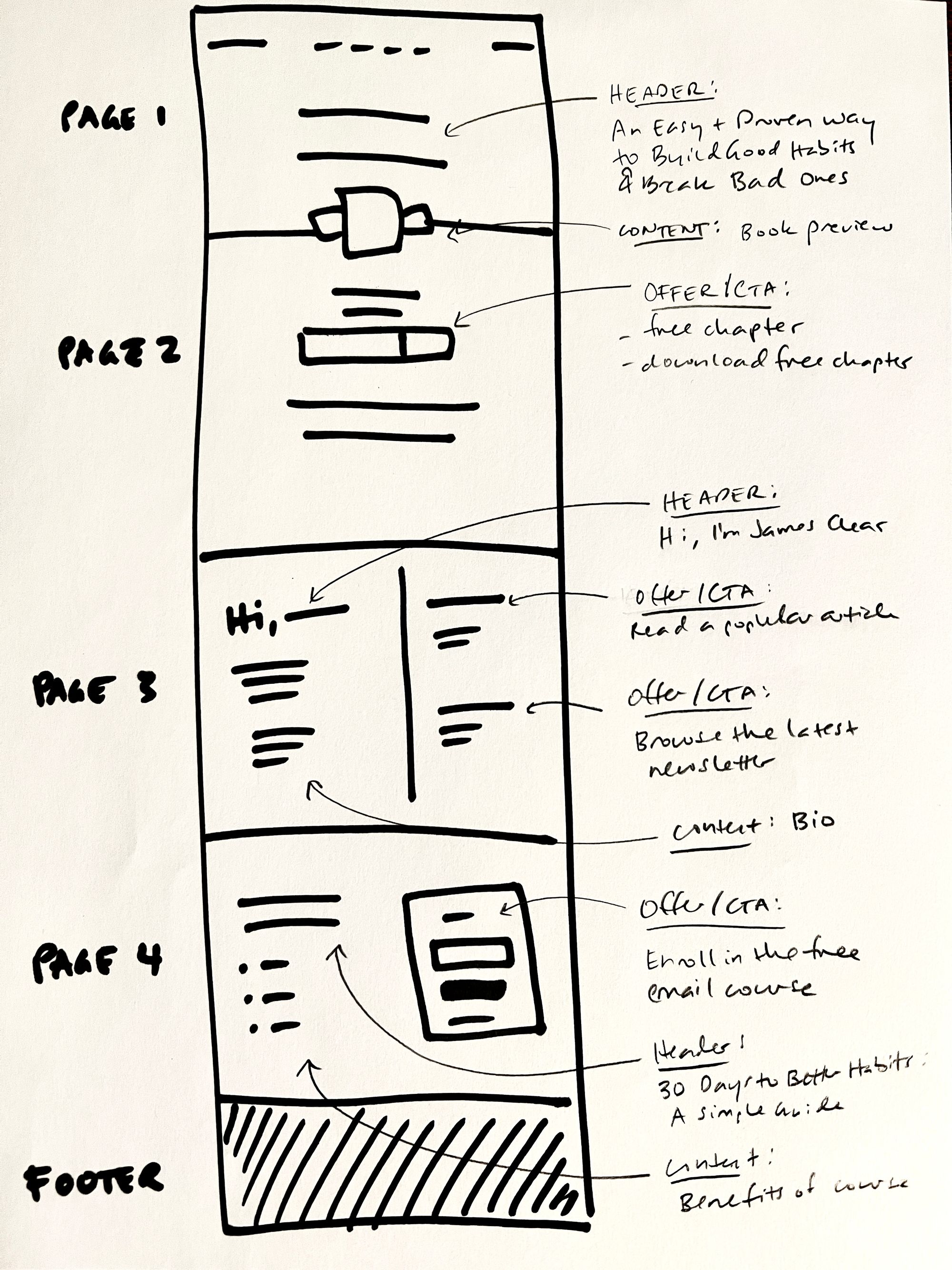
Page # | Header | Content | Offer/CTA |
1-2 | An Easy & Proven Way to Build Good Habits & Break Bad Ones | Book preview | Download free chapter |
3 | Hi, I’m James Clear | Bio | Read a popular article; browse the latest newsletter |
4 | 30 Days to Better Habits: A Simple Guide | Benefits of course | Enroll in the free email course |

Draw your mirror site pages on paper. Describe the Header, Content, and Offer/CTA for each page. This will help you structure your own site without overthinking.
Page # | Header | Content | Offer/CTA |
1 | |||
2 | |||
3 | |||
4 | |||
5 |
Bonus: Write the UVP of the person or organization behind your mirror site.
Uncover Your Core Message
We’re going to name your UVP, your bio, and your offers using the inspiration-driven, freedom-in-constraints approach.
Trying to summarize your identity and your value is a psychological landmine. There are two ways to avoid getting blown up.
- Take the scenic route. Journal, talk with supportive people, and do small experiments over months and years that help you develop a clear sense of self — without confronting the insecurities and triggers head on at every step. I highly encourage this approach in the long run.
- Run with your eyes open. Move as quickly as you can through the field and to the finish line, focusing on taking one step at a time. This is what we’re doing today.
When you challenge yourself to describe what you do and who you are in a single sentence, over and over again, you will start to see patterns and get comfortable with the exercise. You’ll get good at avoiding the landmines (and surviving them!).
Our goal is to find a good enough core message, based on whatever level of clarity you currently have about yourself and your customers/audience, to make a website that looks and sounds like you. Let’s get started.

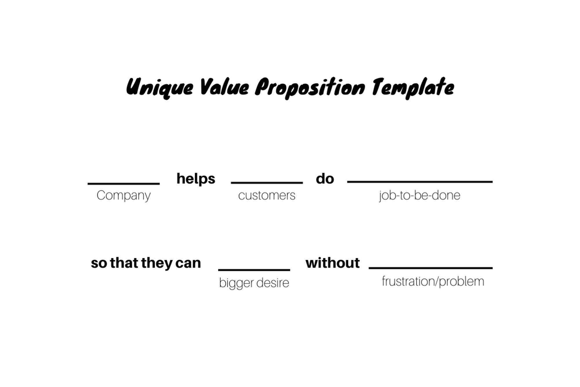
- Unique Value Proposition
Your mission is to name who you help and how.
A super effective UVP helps someone who’s never met you instantly understand exactly who you serve and how you fit into their life. It requires tons of clarity about your customers, how they think and feel and experience the world.
If you aren’t there already, you will only get that level of clarity through interviews and experimentation. You can’t think our way to a great UVP. But you can practice focusing your language and making good guesses.
Let’s start with a brain dump of all the words you’d use to describe your customers and their goals. To provide an example, I’ll reverse-engineer how James Clear might have answered this question.
Customers*
(Clients, Buyers, Readers, Audience) | Job-to-Be-Done (Current Problems, Goals, and Desires) | Bigger Desire (Unmet Desires Beyond this “Job”) | Frustrations with Current Ways of Solving Problem |
Thinkers, doers, problem solvers, decision makers, self-improvement practitioners | Eat healthier, work out regularly, manage time better, build better habits | Live a good life, work smarter, achieve goals, make better choices | Overwhelming, not evidence-based, doesn’t work long-term, overly emotional language |
*Tip: Forget about marketing avatars or ideal customers. Use a simple self-identifier (ideally one that they would use about themselves in conversation) that accurately describes the people you help.
Write at least three versions of your unique value proposition.
Template | I help _____________________________ do ______________________________________ so they can ________________________ without ________________________________. |
UVP 1 | |
UVP 2 | |
UVP 3 |

- Bio
Your mission is to orient someone who’s never heard of you to what you do and how you do it in a few words.
Writing is as much about what you don’t say as what you do. So let’s do a braindump of words that describe you, then play around with pulling them out one by one.
- Titles: How do you describe your role?
- Credibility: What achievements or details from your story help your customers or audience trust you? (Depending on your goals and audience, this might involve intentionally ignoring status symbols or naming a common value.)
- Personality: What flavor of <title> are you? Name any traits or short phrases that align with your personality. (How have friends described you?)
I’ll use James Clear as an example again.
Titles | Credibility | Personality |
Writer, speaker, author, productivity expert, weightlifter, photographer | Author of Atomic Habits, newsletter has 2m subscribers, spoken at Fortune 500s, donates 5% of profits to causes | Pragmatic, action-oriented, concise, thoughtful, scientific, wise |
Tip: Feel free to use a social media bio if you have one. You may end up with a longer bio or no bio for your website. This exercise will be useful either way.
Template | Title + Credibility + Personality |
Example | Writer, advocate for useful ideas, author of NYT bestseller Atomic Habits |
Bio 1 | |
Bio 2 | |
Bio 3 |

- Offers/Calls to Action
Your mission is to outline the ways people can engage with you. How can a potential customer take the next step or keep in touch?
Let’s name all the things you offer, then pick the most important to include in your website. Which of the following ways do you engage with people (professionally)?
Paid Offers:
Free Offers:
Invitations to Connect:
If you have multiple offers, what’s your #1 call to action in each category? What’s the ideal way you’d want someone to interact with you?
Paid Offer | |
Free Offer | |
Invitation to Connect |
Pencil a Bad Draft
Now that you have the core message you want to communicate, writing your site copy is just a creative exercise.
Your mission is to create a really bad paper version of your website experience. If your writing is good, you’re doing it wrong. Just get the ideas down as quickly as you can.
- Pull up your mirror website as a reference. When in doubt, use the mirror site as a template. (Write your version of each headline and call to action.)
- Pull out as many sheets of paper as you need for the pages. When in doubt, use as few pages as possible.
- Write your UVP on the first page.
- Plan which call to action will fit on each page.
- Plan where to put your bio.
- Now fill in the content (including headlines) as if you were explaining to a friend what you plan to say. Don’t try to sound cool or clever. Just say what you want to say as plainly as you can.
Your paper site will look something like this:
That’s it! You’re done for today.
Create a Digital Experience
Tips for making the technical and design challenge of building out your site (on any platform) less painful.

Watch me set up a site on Canva, Carrd, or Squarespace to get a feel for each platform.

Your website is styled and ready. You’ve crafted your story and the experience you want users to have. You’ve answered the hardest questions and done the most important work.
How do you feel about what you’ve accomplished so far?
What new questions have come up?
Build Your Pages
Grab your paper “pages” and let’s go!
- Open your website builder.
- If your template has pre-built pages that don’t match your design, and it offers you options for creating pages that do match, delete them.
- Create pages with the general layout you drafted on paper.
- Starting with headers, fill in the copy.
- Add graphics from your graphic collection.
- Set up any integrations you need to allow your users to engage with you (e.g. scheduling software, payment processing, forms).
- Add a footer with calls to action, links to important pages, and (c) <year> <company>. If you have time and interest, see this blog post for footer inspiration.
- Connect your domain to your site.
Tip: Turn your most important calls to action into buttons with the accent color from your palette. There’s no shame in driving attention to the most important parts of your website. You’re helping users figure out quickly what to do next!
Make It Mobile
How and why to use 3 tools to check your site's mobile-friendliness (after you've published your site).

Over 55% of all website traffic comes from mobile devices. In other words, when people are on your website, it’s more likely that they’re on a phone or tablet than on a computer.
I’s important to check that your website works well in different mobile views. This can be a huge headache and is definitely a game of “good enough”—do your due diligence but don’t expect your site to look the same on every screen. As long as it’s legible and functional, this iteration is good to go!
Your website builder should offer at least one mobile view. Here are some tools for checking more thoroughly:
- Mobile Simulator Chrome Extension shows dozens of screen types
- MobiReady shows how your site will look and perform on high-tier, mid-tier, and low-tier phones (load speeds are more of an issue for phones, especially low-tier)
- ResponsivePX allows you to view your website in any dimensions (requires you to know the dimensions of the screen you want to see)
Polish It Up
- Test like you’re a user. Be thorough!
- Make sure you have a functioning SSL certificate. (SSL certificates allow your domain starts with https:// and shows up as “secure” on web browsers). Most website builders include this automatically. If you want to do a thorough SSL report, use https://www.ssllabs.com/ssltest/analyze.html
- Give your SEO easy boosts. SEO is a complicated beast. Here are a few high ROI items you can do to make your SEO better without going down a rabbit hole.
- Screenshot your site. You can use it for social media announcements, as a backup (in case anything happens), and to share right now as a celebration! Use the GoFullPage extension in Google Chrome for the easiest full-page screen capture.
Prepare to Launch
Celebrate Every Iteration
How to celebrate and launch your new site!

Your aim was to create a website that felt like you in 5 days without overthinking.
What progress did you make toward your goal?
When were you the most creative, and why do you think that is?
What’s the most important thing you learned? Why do you think it’s important?
What do you want to learn next? What questions will you prioritize for the next iteration?
Plan Your Next Steps
Iteration 1 of your site is done. What's next? Learn how to focus in and plan for your next priority.

- Set a launch date. Celebrating your site is a team sport! When do you want to share your site with your network and the world? Is there a meaningful date you can align the launch with?
- Create engaging announcements. Prepare emails and social media posts that tell the story of your website process and encourage people to come along for the ride. We’ll post templates you can use in Disco!
- Set up your next experiment. This iteration of your site was about practicing trusting your gut, owning your vibe, and crafting your story.
Our hypothesis was that if you practice these mindsets and follow the process, you will build a site that feels like you without overthinking in 5 days. What’s the next step of your website process?

My goal for my next website iteration is:

In order to improve _________, I will collect the following data over the next ______ weeks.

© Lean Solopreneur. All rights reserved.